

1/400 | 4.0 | 320 iso| 35mm
Yesterday, I had a photo session with an awesome pair. The objective was to emphasize the couple as a whole and have everything else complement them.
I had three goals:
- Soft Colors
- Simplicity
- Laughs & Smiles
Soft Colors
Here's an example of editing I didn't want:
1/500 | 2.2 | 320 iso |35mm
The skin tone and jeans are distracting, taking away time spent looking at the bigger picture. If you had a second to look at the photo and recall what you saw, the color shouldn't be mentioned at all. Bright colors can forcefully grab your attention like some advertisements do. I.E Fast food, toys, commercials.
Thankfully, both of them are pale so I didn't have to worry loud skin tones. HAHA. When I first started using Lightroom, I boosted the clarity and saturation, pumping them all the way up. I've slowly weaned off of it, but man I do love that clarity.
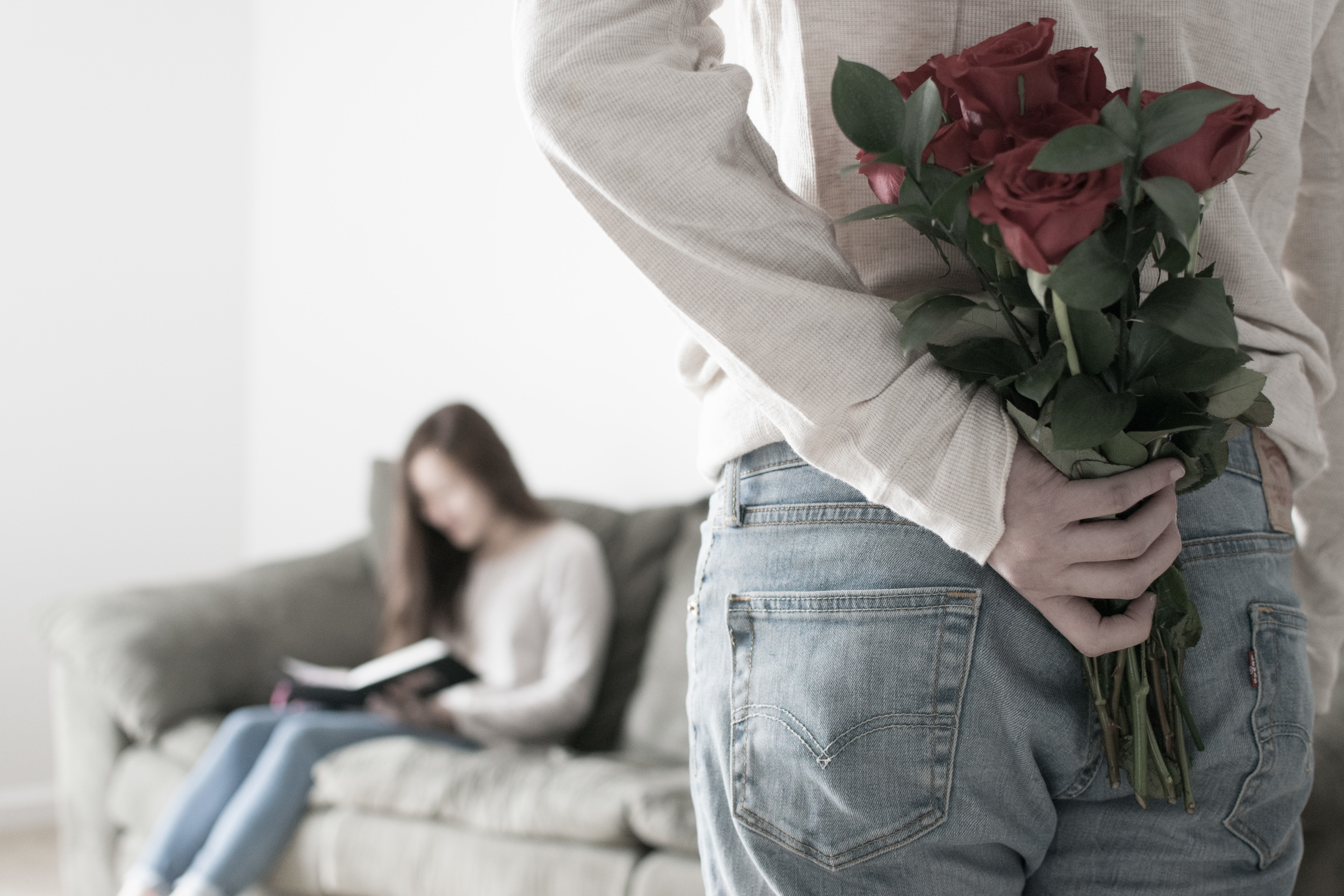
Simplicity

1/250 | 2.8 | 320 iso | 35mm
My goal was for the outfits to complement the two; like Robin, not Batman. Fashion blogs often display strong colors with interesting textures and patterns. Why? That's their focus. The background was a simple white and the couch literally and figuratively supported them. The greyish-green color and soft texture added variety in a great, soft-spoken way.
Laughs & Smiles
I laughed hard editing the photos. Just look at this wedgie. HAHAHA
1/400 | 4.0 | 320 iso | 35mm
Laughter is the shortest distance between two people

1/200 | 5.6 | 320 iso | 40mm
What we laugh at says volumes about us. For them? It was little things... and the wedgie. They didn't have to try; it came naturally. The photos should be like waking up to the faint aroma of coffee brewing on a Saturday morning. It should gently nudge you to alertness, not slap you in the face with rotten salmon.

1/500 | 2.2 | 320 iso | 35mm
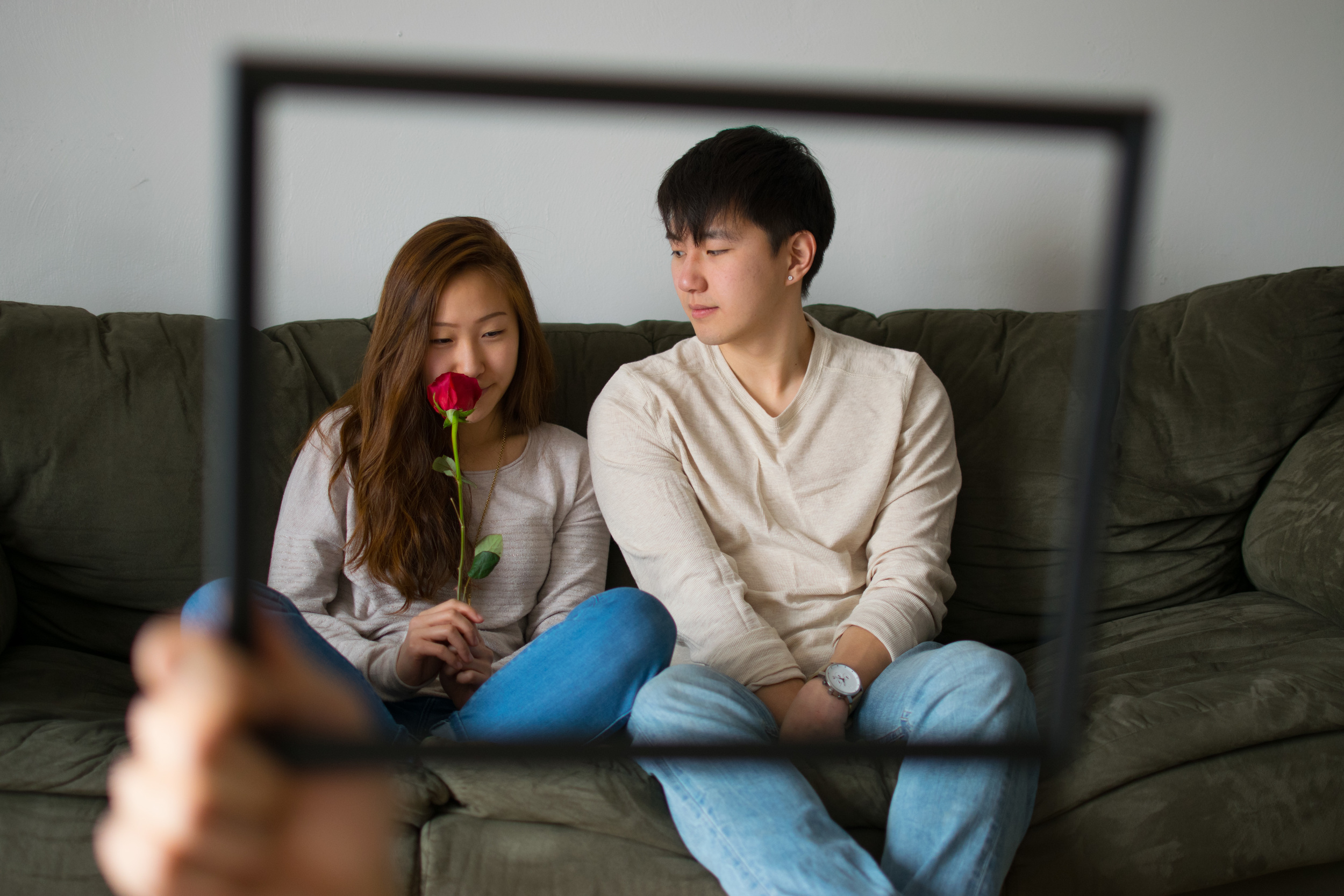
For the last few shots, I used my tripod and my phone as a remote. It took awhile to get the shot but hey, I think it worked out great. ALSO, this is a great example of color dissonance. Notice how my shirt tragically clashes with the two! The patterns and color are too vibrant and it's just blah.

1/500 | 2.2 | 320 iso | 35mm
What do you guys think? Let me know how I can improve! Check out more of their photos here.
Goals to work on:
- Consistent exposure and colors throughout a photo session
- Use of reflectors
- Composition
happy birthday, yoon jang.